
Screen Resolution And Web Design – An Overview You’ll Never Forget.
By Tara Hornor
Mar 21, 2014
Within the wonderfully complex world that is web design, professionals face some very difficult technicalities, with screen resolution arguably one of the biggest causes for throbbing headaches. Sometimes this deceptively small problem can seem hopelessly devoid of solutions, since resolutions and devices constantly change and improve. However, there are some best practices that web designers and developers can follow to design a website, and an in-depth look at device resolution reveals what these are.
Many mistake the term to refer to actual screen sizes. However, as tech-savvy web designers know, screen resolution is the term used for the number of pixels a screen contains horizontally and vertically, such as 1024 × 768, wherein the former number refers to the horizontal pixels and the latter refers to the vertical pixels.
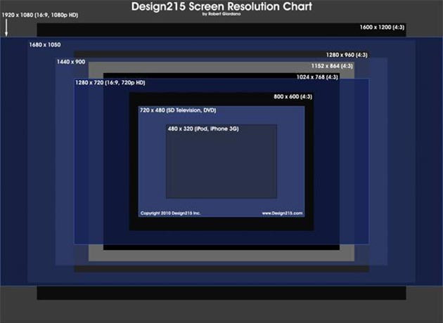
Photo credit: Design215.com
The confusing part comes when two of the same screen sizes have different screen resolutions. This also means that different screen sizes can have the same resolution. For instance, a 13-inch screen can have the same 1280 × 800 resolution as a larger 17-inch screen.
How a website is displayed on a screen will be quite different depending on different screen resolutions. As an example, two 17-inch desktop monitors may have different resolutions, with one being 1024 × 768 and the other 1280 × 800. The lower resolution (1024 × 768) will display elements in a larger size to keep the display as sharp as possible, but this also means that less of the page will fit on the screen. The higher-resolution monitor will be able to display more of the website page, such as the entire fold plus a little below, and elements on the page will look smaller but sharper.
In his advice on best practices for device resolution in design, Jakob Neilson of the Neilson Norman Group points out that you never want to design a website for a monitor size. For one, users with uber-screens, such as a 30-inch, may never maximize a window due to their abnormally wide monitor. Also, screen sizes come in way too many shapes and sizes. It is simply much more efficient to focus on the resolution.
In the past, it was much easier to know what resolution to design for. High resolutions were very expensive, so most users could only afford one of the three cheaper resolutions: 640 × 480, 800 × 600, or 1024 × 768, as Andrew Keir mentions.
Photo Credit: jorge.correa via Compfight cc
However, today there are many more high-resolution screens available at prices the majority of consumers can afford. And then there’s the additional consideration of mobile devices. With tablet and smartphone users on the exponential rise, web designers have no choice but to consider these smaller screen resolutions again.
Thankfully, there are some best practices for choosing the right resolution to design a website. There are also some workaround options for making sure that if someone with an odd or old-fashioned screen resolution does visit your website, they will still have a positive viewing experience.
Common Resolutions And Best Size For Web Design.
Most web designers and developers agree that one of the best practices is to optimize a design for the resolution most popular with your audience. This can be harder to define today, though, with so many different resolutions available.
At the beginning of 2012, most web users had a screen resolution of either 1366 × 768, 1024 × 768, or 1280 × 800. This has changed quite a bit today, however, and goes to show just how quickly optimal resolution sizes will change over time for web design.

Minimum Screen Resolution.
For instance, W3Schools shows as of January 2014, “99% of your visitors have a resolution of 1024 × 768 pixels or higher.” This provides quite a strong argument for catering to the minimum of 1024 × 768. Shaun Anderson also reveals statistical evidence that most website visitors have a resolution of this size or higher.
Top Screen Resolutions Worldwide.
What is interesting about the statistics that Anderson presents, though, is that only 9% worldwide use 1024 × 768 with 30% using a resolution of 1366 × 768, and about 15% using a device resolution designated as “other,” which more than likely is mobile use.
Mobify’s study analyzed 2012 activity of 200 million shoppers on the Mobify Cloud network (ecommerce websites powered by Mobify). The study showed some interesting findings:
1. 19.5% of visitors used a netbook resolution of 1280 × 800.
2. 13.5% used 1366 × 768.
3. 11.4% used the iPhone size: 320 × 480.
4. 7.8% used 1024 × 768, bringing it to fourth place.
5. 7.3% used 768 × 1024, common of iPads and horizontal 10-inch netbooks.
6. 7.3% used larger laptops sized 1440 × 900.
7. 6.5% used 1280 × 1024, a common LCD desktop monitor.
8. 6.1% used 1080p HD displays (1920 × 1080).
9. 5.1% used the common widescreen resolution of 1680 × 1050.
10. 3.8% used the HD+ 1600 × 900 screen size.

Click the image to see the full infographic from Mobify.
What Is The Best Size?
As mentioned already, many argue that you should at least optimize website designs for 1024 × 768. This should make a website look fairly good on most resolutions and devices. However, this can still cause quite a few problems, especially with the rise of mobile devices for accessing the Internet. This is where web designers really have to know their audience and ultimately design for this audience.
What if you don’t know your audience and you don’t want to limit your design to a specific resolution? Let’s take a look at some more best practices for devices and web design.
An Introduction To SVG (Scalable Vector Graphics).
Adam Fairhead presents an interesting idea in his article on WebDesignerDepot, aptly titled, “Stop chasing screen resolutions", and his point is exactly this. Fairhead believes that web designers no longer have to worry about screen resolutions due to SVG or Scalable Vector Graphics. SVG is an HTML5 technology that allows images (vector ones, to be exact) to be displayed using code, which make for a clear image, no matter the resolution of a user’s screen, which is really handy when you create a responsive website.
PPI And Retina Graphics.
Let’s stop a moment and discuss PPI (pixels per inch), which refers to the resolution of images. PPI is affected by the screen resolution and the actual screen size as determined by the diagonal length in inches, as demonstrated by this PPI tool from DPILove. Knowing what PPI to use for websites has been easy in the past: web designers knew that 72ppi would ensure that images appeared crisp within a website but still loaded at an appropriate speed, simply because most monitor sizes correlated with resolutions as such.

The big problem in screen resolution since Apple came out with the iPhone4 is with retina graphics. Retina graphic devices are those with a resolution far above traditional screens. Why is this a problem? Because images optimized at 72ppi now appear blurry on smaller screens that display upwards of 200ppi.
Retina Graphics Are Resolution-Dependent.
Different methods for converting a website to retina have emerged, such as using CSS Sprites or Retina images that are at 2x their original size to keep the image looking clear no matter the resolution. Fairhead points out, though, that these methods still make us dependent on the resolution, for as resolutions continue to increase, so will the need for image sizes.
And this still doesn’t solve the problem of zooming in on a web page, for example on an iPhone. When users try to view the web page at a zoomable size, the images go blurry again.
The SVG Solution.
Because SVG uses vector graphics, they will look great no matter the resolution. Bitmap images (retina images) are based on pixels, so as a bitmap image is stretched beyond its optimal pixel resolution, it starts to appear blurry or “pixelated.” Vectors are scalable to any size since they are based on a mathematical formula, rather than a certain amount of pixels. So when scaled, vectors appear clean at any size due to the formula adjustments, hence the reason designers use them to create a responsive website.

Image credit: arrashthearcher.org
The other benefit of using vector graphics rather than bitmaps is that the load time of vector images is the same no matter the size. A 2000px × 2000px bitmap image takes much too long to load. A 2000px vector image doesn’t require individual pixels to load, so it doesn’t matter if the vector is as small as 20px or as large as 4000px.
Limitations Of SVG.
So why isn’t SVG touted as a complete resolution solution? Well, it can’t contain bitmap images at all, for one. And they can’t be too complicated in design or else it will affect load time, even as a vector.
The final big complication with SVG is that it’s a fairly difficult code to learn. Adam Fairhead explains it like this:
SVG code isn’t something you can “see in your mind” like when you read HTML. It’s a series of instructions mapped respectively against one another, element by element, layer by layer.
So, if a web designer already has no knowledge of code, designing for SVG could be nearly impossible.
Fullscreen Websites.
More best practices for device design refer to type of design for a website, such as a fullscreen website, which is a design that fills the entire browser window, no matter the screen resolution. This type of web design involves using a super large image, such as 2560 × 1290, CSS, and HTML so that the website looks good whether on large or small screen resolutions. Some absolutely beautiful website designs have emerged from this practice:

Visit the Made in Days website

Visit the Keecker website

Visit the Grove Made website
CSS Tutorials.
Using CSS, stretching the background to fullscreen browser width can be quite easy. Many tutorials also explain how to place HTML over the images, such as when displaying your header and navigation menu. The following are a few excellent tuts:
Building an amazing fullscreen mobile experience - Paul Kinlan
CSS Full Screen Background (quick tip code) - John Surdakowski
Creating a Full Screen Background for Websites - Web Design Views
Fullscreen Layout with Page Transitions - Mary Lou
Fullscreen Limitations.
One of the major annoyances with designing for browsers rather than resolution is that you have to test cross-browser compatibility. And this brings us back to a very familiar problem: as with resolution, you have to know your audience and their most common browsers. As with screen resolution, you are always going to disappoint a small portion of your website visitors who use outdated browsers.
Responsive Website Design.
A very hotly debated solution is to create a responsive website design. Some believe that responsive websites are the ultimate in best practices for resolution, since it can make a website look and feel beautifully consistent across any device.
A responsive design is also Google’s favorite layout forsmartphone, interestingly enough.
Is Adaptive Design A Better Option?
Some designers believe that an adaptive design is better for most websites due to the control over elements. This option uses a fixed layout that changes based on the device used to access the website.

The benefit for an adaptive design, as Ravi pratap in VentureBeat explains, is that the website can be more easily customized for a “highly differentiated experience that is built for the specific intent of your mobile customer.” But again, we are running into the problem of device resolution with adaptive design.
Pixel-Perfect Responsive Web Design.
Responsive website design solves the problem of adaptive design in that it is fluid, which works out great for many websites, especially those who want to provide an identical experience across devices. Some websites find adaptive and responsive too limiting when they need both a flexible and customized experience. Pixel-perfect responsive designs fill in the gap between the choice to create a responsive website or adaptive website by combining the best aspects of both types of design.

Taking a look at the ProStory website on Screenfly shows the flexibility of responsive design.
Like adaptive design, pixel-perfect responsive design allows the website to adapt for certain sizes. It gives designers precise control down to each pixel so that the website functions exactly as desired on different devices. Like responsive design, pixel-perfect design is flexible and fluid and scales every part of the design – images, content, etc – no matter the size of the device. Designers simply designate breakpoints for a pixel-accurate website no matter the view. A bonus? It still falls under Google’s favored design
How Screen Resolution Affects Professional Designers.
Screen resolution will continue to be a factor for web designers to keep in mind when they create a website as higher resolutions are created and web technology evolves. This is why it is important for web designers to know some best practices as well as their client’s audience.
Different clients want to reach their audience in unique ways and provide tailored experiences depending on where their audience encounters them. For many clients, this may mean a combination of functionalities, such as a pixel-perfect responsive website design with SVG images.
As a web designer, it is your job to be informed about the best way to help your client achieve these goals, and device resolution is one very important piece of the web design puzzle.
How do you deal with screen resolution when you design a website as a web designer or developer? Do you use one of the best practices above or another? Feel free to share your experiences in the comments below!
Brought to You by Webydo.
See how Webydo fits into your design workflow and business.
Request A Live Demo
Blog Menu
