
Kill’em All: Web Design Trends that Should Die in 2016 (I Hope).
By Ezequiel Bruni
Dec 15, 2015
Once upon a time, radio stations used to play this song called, “Total Eclipse of the Heart” at least ten times a day. They don’t play that song anymore.
They didn’t stop playing it because it was a bad song. They didn’t stop playing it because the artist had fallen out of favor. They stopped playing it because they had played it so often that people often got irrationally angry within the first thirty seconds of hearing the song played yet again. And who can blame them?

In web design, we’ve had a few “songs” like that. Blinking text marquees. Dancing baby GIFs. Leather textures everywhere.
Some of these design elements were just bad. We used them because the industry was young, and we didn’t know any better. More recently, we’ve taken to killing off good things, because we just don’t know when to stop. After the glut of pseudo-realism in design came the backlash and only just now are we rediscovering that a little skeuomorphism never killed anybody.
Giant hero shots, huge text, parallax effects and many other things are getting the same treatment. These are not all bad things in and of themselves. However, we might need to put away some of our one-hit-wonders for a while, until we can learn to use them in moderation. And then, some of them just need to go altogether.
Overused Low-poly Backgrounds.
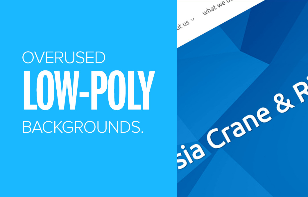
We get it, you’re hip and modern, but you can also get back to the basics. Or, you saw someone else do something cool with these low-polygon graphic thingies and it looks really cool, so why can’t you do it too?
Well maybe you shouldn’t do it because you’re a law firm that’s been around for one-hundred years and no one actually wants you to be hip and modern. Or perhaps you’re a photography studio and that huge graphical header is actually distracting people from your work…you know, the photos?
The point is that Things That are Cool are not always right for the job at hand.
The Ubiquitous “Fold.”

But the fold is still here. Granted, few people try to fit all of their important information above the fold anymore. Now, this monster has mutated. Now, apparently, everything has to be under the fold. Above the fold, we’re only allowed to have giant background images or videos combined with (maybe) some big text.
Let’s be clear, this can be just as bad for usability if it’s done wrong and it usually is. At the very least, tell your users what your website is about and suggest a next step.
Overbearing Hero Carousels.

If you thought the giant full-page splash screens were getting annoying, wait until someone decides to animate them. Let’s be perfectly clear here: carousels of any size are bad for UX, and sometimes SEO...carousels that take up the whole screen are bad for UX, performance, and sometimes SEO.
They’ll take more bandwidth to load, often run slowly on older machines or mobile devices, they sometimes confuse users and that’s when they actually work. Slideshows are not a substitute for actually organizing your content.
Inconvenient Hover Activation.

Now, I won’t ever tell you to get rid of hover-triggered effects. They’re just too useful as a way to tell the user, “Click me and I’ll take you on an adventure! Or at least to a different page.” However, as more people have implemented hover effects for title cards, images, random decorative animations and ill-conceived drop-down menus, the hover-based transition has become a nuisance more often as not.
Imagine, for a second, that you’re moving your mouse from Element A to Element B. Along the way, you hover over Element C for a split second...it expands outward so you can see it better and suddenly, Element B is blocked. The user is then presented with an impromptu puzzle.
Where do they move the mouse to get rid of Element C, so that they can click on the object of their interest, Element B? Will anything else block their progress along the way? There’s only one way to find out! Trial and error. No one likes that kind of adventure.
Lame Pop-ups.

Now, a lot has been said about the evils of unsolicited pop-ups, pop-unders and worse, pop-up ads. Then there are the pop-up ads and newsletter offers that show up when you first load the page, or before you’ve finished reading the articles. And then, even after you’ve dismissed them, or signed up for the newsletter, these things will keep showing up on every page of the site.
At this point, if you’re a website owner or designer and you do this, there’s not a lot to say besides, “Bad web designer. Bad!”
Parallax Overload.

Parallax effects are one of those things I mentioned that aren’t bad on their own, but are a bit overdone. Parallax is usually a way to make a page that’s light on content look a bit fancier. There are other ways. Parallax effects are resource-intensive and usually just unnecessary. Webydo is guilty of this, though they do try to tell a story with it, which is more than you can say for most parallax-based designs.
Try taking a cue from Webydo and playing with the layout a bit to tell a cohesive story. See if you can find another way.
Social Media Overkill.

You don’t need that many social sharing buttons on each and every article. Chances are that your particular niche or user audience sticks to a few social networks. Four, max. You might have fans on one or two additional platforms, but there won’t be very many of them and people are usually perfectly comfortable copying and pasting links when necessary.
It’s not just a matter of clutter, though. Social media buttons often come with tracking codes, counters and other things that will just slow down your site. Save everyone some bandwidth, and use them sparingly.
Unwarranted Autoplay.

Full disclosure, I’m one of those curmudgeons who thinks that nothing should play automatically, especially if it has sound. This is even more true if your user is on a network with a capped data plan. Just don’t. Don’t. It’s time to let it go.
Animated/video backgrounds are sometimes an exception to this rule when done with a light touch.
Long, Complicated Forms.

This is a mistake often made by corporate sites and others that want very desperately to get as much information from their users as possible.
Forms should be as short and intelligent as possible. The more information you ask them for, the more frustrated and skittish they’ll be. It only gets worse when something goes wrong and they have to fill it all out again.
Overly Complex Design.

Worse than complex forms are sites that just…overdo it. Attention to detail is important. An overabundance of details is just silly. You’re supposed to be directing your user down one (or two, max) path to buying whatever it is that you’re selling. Overcomplicating the layout and navigation of your site doesn’t do you, or them, any favors.
Whether it’s a layout that goes all over the place, using too many colors, or too many different kinds of fonts, complexity is distracting. You want your users to focus.
So How Do We Get It Right?
Just because something is trendy doesn’t make it categorically good or bad. The problem comes when people say, “That looks cool, let’s do that!” without thinking of the implications for their own users..
Trends become trends for a reason and it’s not wrong to adopt one, if it’s right for the project in question. But make sure to ask yourself first “Is it necessary?”
Ezequiel Bruni is a UX designer, writer and aspiring photographer living in Mexico. When he's not up to his finely-chiseled ears in wire-frames or front-end code, he makes mouth-watering tacos. Give him a should out on Twitter @ezequielbruni.
Brought to you by Webydo.
Craft Your Design Without Code.
TM
Blog Menu
